How to Choose (Good) Website Colors
Remember when you were a kid with a coloring book and you’d open the crayon box, stare at the colors and wonder where to begin? Or maybe you still do that. (We do.) Picking website colors can feel a lot like that, especially if you don’t have an established brand guide. That’s ok! You don’t necessarily need a brand guide before a website. In fact, many of our clients have discovered their brand through the process of creating their websites.
One of the biggest components of your website is your color palette. Everything we see is made up of hues and shades, and our brains process colors working together on an almost subconscious level. We know what looks good to us and we know when a color combination is horrid. Though color preference can be subjective, here are 3 rules of visual harmony that all professional websites should adhere to.

Contrast
This is a biggie. Contrast between light and dark colors not only looks good, it also helps text to be more legible. This is why you so often see black text on white backgrounds or white text on black.
Notice how much easier it is to read the top word than the bottom? That’s thanks to contrast!
Harmony
Colors need to play well together. This is why we have the color wheel! You probably remember hearing about primary, secondary, and complementary colors in school, but might not remember what it all means. That’s ok – we often need to cheat too. Check out this free guide and palette maker from Canva and find your perfect color combination.


Limits
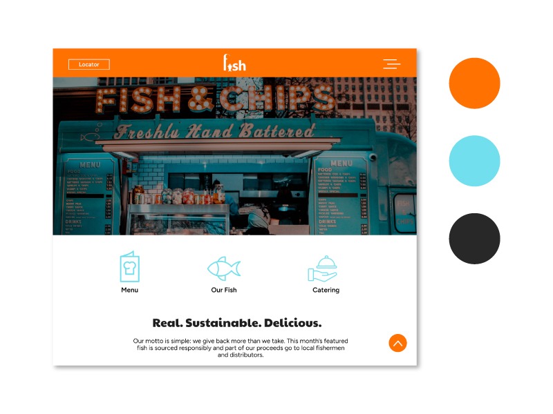
Try to stick with no more than 3 or 4 colors. Too many colors get complicated and distracting and can skew your brand. It’s best to choose one primary color (used the most), a secondary or accent color (used less frequently), and a tertiary color (used sparingly).
So how the heck do I choose?
Narrowing down your site to 3 solid colors that work well together can be tricky, but well worth the time you put in to choose them. If you’re not sure where to start, make a list of words associated with your brand, product or service. If you own a heating and air conditioning company, you might instantly think “hot” and “cold” which would lead you to “red” and “blue.” But before you just pick any old red and blue, consider what shade of red and blue. Think about it: a navy blue with more of a burgundy red is way different from a bright orange-red and electric blue.
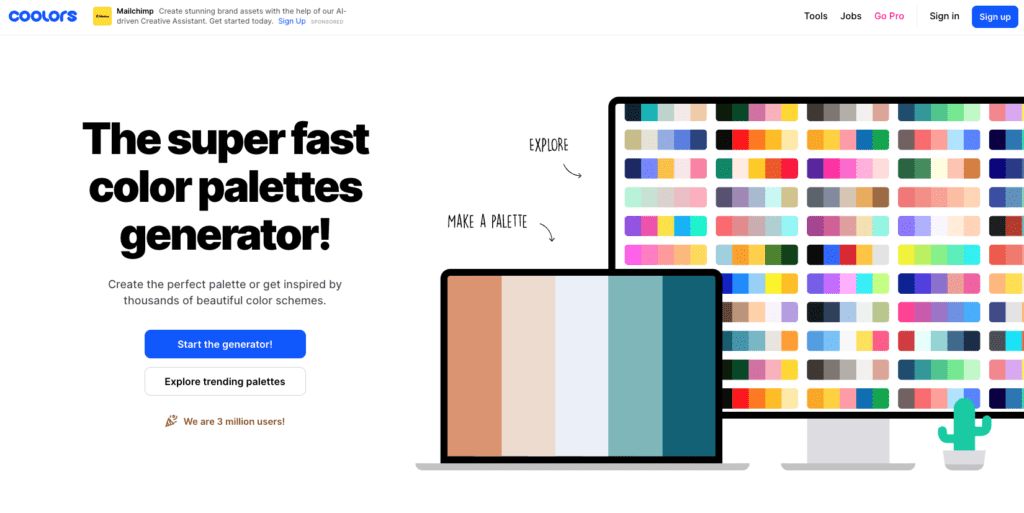
Want to pair colors and see how they look together? Create some swatches! Or, use an online generator like Coolors, which helps you pick out great colors in a few seconds. If you gather inspiration from real-life objects, just remember that the RGB color value on a computer might look slightly different from the value on that Behr paint swatch or Crayola crayon.

There are so many free resources for color help, that you shouldn’t have too much trouble finding your dream match. But, if you would like professional help and advice, our design team is obsessed with color and armed with a very large book of swatches that can be turned into RGB values instantly. Above all, enjoy the process of choosing your website colors!


You must be logged in to post a comment.