About Sunrise Banks
Sunrise Banks creates a better perception of what a bank can be. Aiming to be a social engine for change, they offer financially inclusive products and services to better the lives of their clients in the Twin Cities Metro and beyond. This is our third year working with Sunrise Banks on their impact report microsite.
Project Deliverables
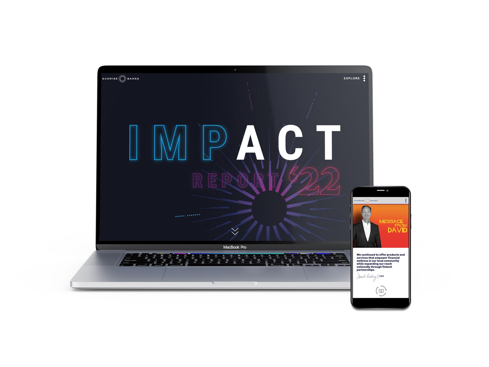
While keeping some of the familiar elements from the 2021 impact report website, we also pushed ourselves to come up with something next-level for the 2022 site. Taking design inspiration from the printed impact report designed by Judd Einan of Fluence Creative, we focused our aesthetic on bright, vivid colors, typography-based design and fun neon elements. Additionally, we incorporated more playful animations and movement to enhance the user experience.

We don’t see ourselves as bankers –
we see ourselves as a social engine for good.
SUNRISE BANKS
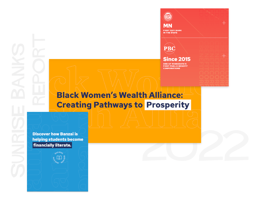
Focal Points & Features
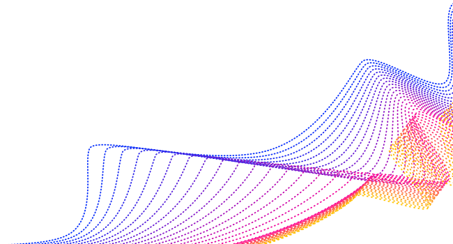
Moving Gradients
Some of the sections on the microsite incorporate moving gradient backgrounds. The effect is subtle but just enough to create depth and movement in otherwise plain sections.
Typography
Taking inspiration from the printed report, which uses type in repeated patterns as design elements, we let the type speak for itself on the 2022 website. Titles were created in the playful “Hitchcock” font, and subtle outlined type was the primary design element for our Brand Journalism section.
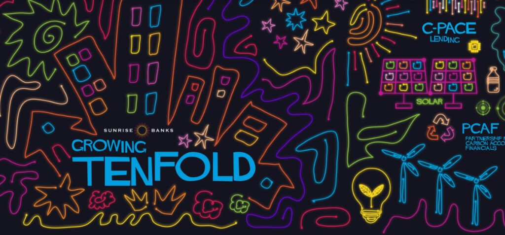
Neon Effect
Neon played a huge part in the look of this year’s report, both in print and on the microsite. Taking inspiration from Judd Einan’s illustrative elements, we included plenty of neon effects, especially on black backgrounds. We also took inspiration for the color scheme from the bright and retro colors used in the printed report.
Video Backgrounds
Video backgrounds are extremely popular in web design right now, and it’s no wonder! After working with a section that needed a little something extra, we discovered how much impact a simple video can make. Using drone footage Erika shot of Northern Minnesota, we applied some filters and created a very fun section for One Tree Planted.
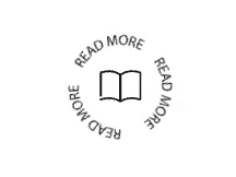
Rotating Buttons
Pill buttons are SO last year. One of our biggest additions to the microsite this year was the new buttons. Using rotating text around simple icons, the buttons create a kind of stamp effect on the sections, and prompt the user to engage with them due to their movement. On hover, the buttons fill.
We can honestly say we had so much fun working on this microsite! The challenges of the project helped us advance as web developers. Website design is always evolving, and through our learning processes, we’re always coming up with exciting new ideas to bring websites to life.
You must be logged in to post a comment.