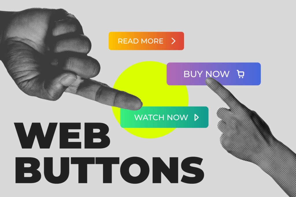
How do people interact with web pages?
Click below to find out!
Got you to click!
All because we used a button. Web buttons are the way your website guides users around, prompts them to take action, and allows them to find information. All web pages need buttons. Hamburger menus, drop-downs, and even plain text with an underline or indication can be considered buttons if they promote interactions. Let’s go over buttons and how to best use them.
Buttons are CTAs
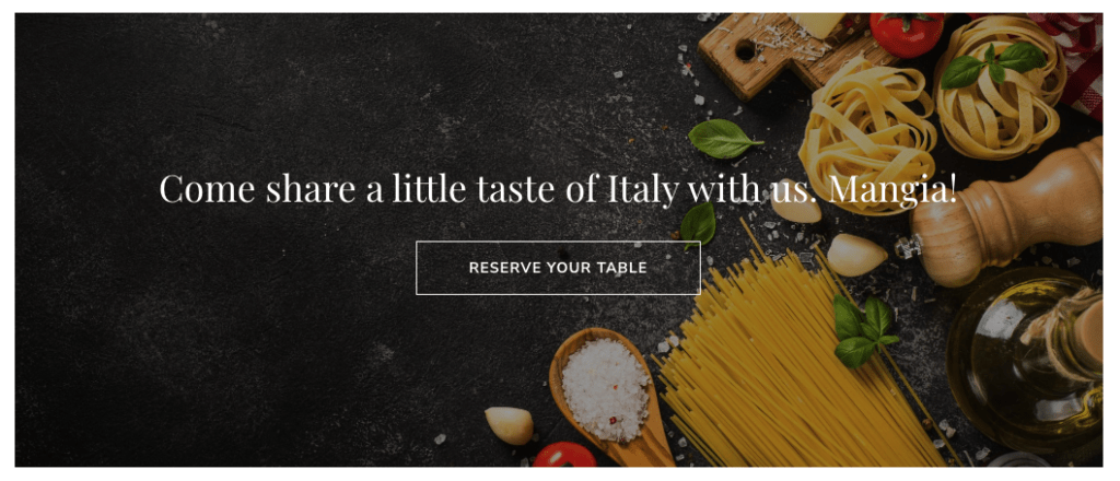
A CTA or “call to action” is used on a web page to encourage the user to do something, just as we told you to click above. CTAs can be anything from “order now” to “learn more” to “contact us.” CTAs are important on web pages because they usually lead to some kind of conversion, action or sale. That being said, CTA buttons should be easy to find and use, like in the banner below.

Buttons Organize Content
Buttons help keep pages clean by showing or hiding information on hover or click. Think FAQ pages or product detail drop-downs. This practice is becoming more common as web design gets more advanced, but always make sure functionality comes first. Your user should know how to interact to get that content.
Buttons Help Us Navigate
Menu buttons and hamburger drop-downs help organize pages and subpages on websites. Buttons are also ways to share links, whether to internal pages on your own site or external websites. They are also used to help us scroll through content or move to the next page or section of something. Think arrows or chevrons.
The Dos & Don’ts
Good button practices start with considering the user interaction first. Buttons could look really cool but if they don’t lead to users clicking, they aren’t doing you any good. Make buttons look clickable by using familiar shapes, design indicators, and helpful, brief CTA text. It’s good to have 2-3 different styles of buttons on your site but no more than that.
You’ll also want to consider how buttons react when clicked. Buttons that have “feedback” like color changes and/or hover animations show users that their click worked. Don’t forget that interactions are slightly different on mobile, so you’ll want to make sure your mobile buttons stand out and are large enough for fingers to click on.
Do:
Don’t:
To put it simply, web buttons are one of the most important components of your website. They facilitate the interaction between site and user, and their design, placement and functionality directly impact the overall success of a website. Need some more inspiration? Check out these tips for using buttons to create conversions.


You must be logged in to post a comment.