About Sunrise Banks
Sunrise Banks is not a typical bank, they pride themselves in creating a better perception of what a bank can be. As they say, “our success relies on the success of the communities we serve.” They offer financially inclusive products that aim to better the lives of their clients in the Twin Cities Metro and beyond.
Advocates for Social & Environmental Impact
For the seventh consecutive year, Sunrise Banks was distinguished as one of the top B Corporations, receiving “Best for the World” honors for overall social and environmental impact. Certified B Corps™ balance purpose and profit and together are driving a global movement of using business as a force for good.
Project Deliverables
Ashley Cooper the Creative Director of Sunrise Banks reached out to us to work on this unique and exciting project. In past years their team collaborated to create a printed booklet of their Annual Impact Report, which highlighted features such as their Promise to the Planet initiative for the environment, their Loan Portfolio, customer stories, how they gave back to the community, and more.
For the 2020 report, it was essential to take the Impact Report to the next level to thoughtfully pay tribute to the many significant events that took place during a turbulent year. Such as the effects of the global pandemic and highlighting the important conversation around the racial justice uprising that ignited in the Sunrise Banks’ community after George Floyd was killed in May of 2020. It was important to not only highlight the harrowing occurrences but to also represent the sense of optimism and resilience we adopted to get through uncertain times.
To effectively communicate this, Sunrise Banks knew that a custom website paired with their signature booklet would be able to reach their thousands of loyal customers and beyond to showcase what this year really looked like for them as a company and a community.
We don’t see ourselves as bankers –
we see ourselves as a social engine for good.
SUNRISE BANKS
GROUND ZERO OBJECTIVES
- Create a one-page website reminiscent of a continuous printable PDF
- Strategize to structure a sitemap that covered every element that was in the printed booklet plus more
- Cultivate a design direction for the website that was evocative of the printed booklet, which was created in tandem by the graphic designer and creative team at Sunrise Banks
- Design a user-friendly navigation system that makes it easy for users to jump to different sections of the report
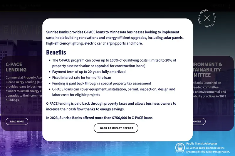
- Integrate modals for specific sections that have more to read, such as Customer Stories
- Build responsive user interface designs which melded web elements with the collection of graphical elements designed by the Sunrise Banks creative team
- Implement technical applications of SVG animation powered by GSAP JS library
- Integrate dynamic QR codes to link from the printed booklet to specific URLs on the website
BRANDING
Typography & Color Palette
The bold and bright use of color is apparent from the get-go on this website. The inspiration came from the sentiment of looking at 2020 through “rose-colored glasses”– celebrating the resilience we gained, reflecting on the less than rosy moments, and relinquishing the stress we all felt during a tumultuous year. For the typography of the site, Ashley Cooper, Sunrise Banks Creative Director was adamant (and rightly so) that we incorporated the angular, yet elegant serif font Mercury to the site. We paired Mercury with the web-friendly go-to Google font, Red Hat to complement the poignant serif motifs.
Focal Points & Features
Three Ways to Navigate
Creating the navigation was an intricate and strategic process. Typically one-page websites boast only around five anchorable sections, in this case in order to cover all of the important information in the report, we had to come up with a plan to create a dynamic side indicator style menu that could jump between sixteen different sections.
- “Jump to” global menu with anchors
- Side indicator menu with anchors
- Intuitive progress bar with the section title label
Text Trail Effect
Throughout this project, we pushed ourselves to try new techniques and experiment with what was possible using advanced CSS and GSAP animations. For the main hero banner, it was important to grab the user’s attention and we wanted to play off of the literal idea of “making an impact” with this in mind we brainstormed about different types of motion we could incorporate, such as video, 3D animations, masking effects, and more. After combing through a mood board full of ideas, we decided to make the typography shine by creating this interesting looping text trail effect that would engage users right away, by coaxing them to keep scrolling to find even more examples of fun motion that would keep them hooked.
Micro-interactive Cursor
We implemented a unique intuitive cursor that responds to how the user browses. It reacts differently to each type of layout down the page and we even added some fun Easter eggs, like the leaf pointer on the Environment section.
Pinned Position Transition
It was important to us to showcase the Racial Equity section of the Impact Report in a distinctive presentation that would correlate with the significance of the content and engage users. We applied a pinning feature to reveal the image of the powerful mural of George Floyd painted on the wall of Cup Foods in Minneapolis. co-created by Cadex Herrera. Along with this interaction, we accented it with a yellow highlighting effect to emphasize the words of the official statement made by Sunrise Banks after news broke about George Floyd’s death in May of 2020.
Looking forward to more on the horizon with Sunrise Banks
We are beyond thrilled to share this project as our debut collaboration with the amazing team at Sunrise Banks. We are eager to continue working alongside them to showcase to the world that a bank can truly make an impact on communities and the environment. We are honored to have a new partnership with Sunrise Banks!
You must be logged in to post a comment.