
Make an Impression
Contrast is an impactful element that is used in many realms of design. Not only does strong contrast create an attention-grabbing visual, but it also allows design elements to work well together despite their differences and creates a sense of balance. So, let’s talk about some of the ways contrast can be utilized in your website design.
What are the different ways to use contrast? Well, some of the most common ways include:
- Color
- Size
- Space
- Shape/Element type
Let’s break each of these down.
Color
Probably the most known way to utilize contrast is through color. However, one of the most important uses of color contrast actually deals with accessibility over design. Whether you know it or not, you use color contrast all the time. In fact, if we weren’t using color contrast right now, you probably would not be able to read this article.
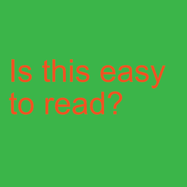
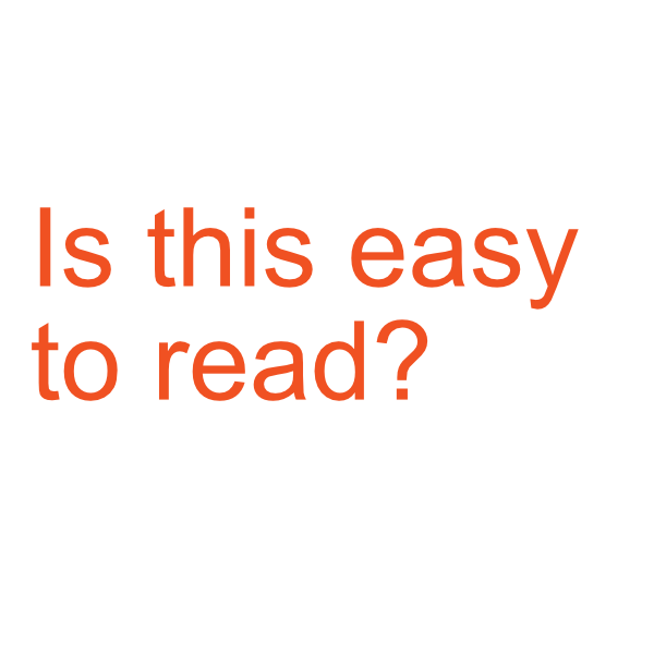
The color contrast between text and background is what allows us to see these words. In terms of accessibility, people with visual impairments or color vision deficiencies may be unable to distinguish between text and background with poor contrast, meaning they would not be able to read the text. For example, the image below shows good contrast on the left and bad contrast on the right. As you can see, poor contrast is much harder on the eyes, and for people with visual impairments, maybe impossible to read.
Accessibility is the most important here, but bad color contrast can also have a negative effect on design. Poor color contrast can greatly diminish the user experience on your website, which can have a huge impact on your traffic, rankings, and your goals.
A great way to ensure your website is accessible is by using a contrast checker such as WebAIM. This website allows you to input colors you are using and checks for its contrast ratio. The site also has great information regarding web content accessibility guidelines.
Size
Use Headings
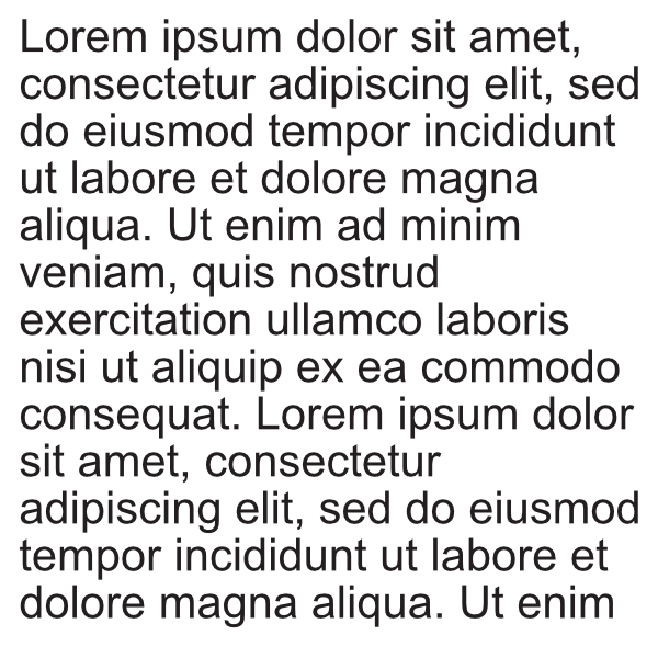
Another great use of contrast is used in the size of elements on your website. A simple example of this is the use of headings to break up text. This use of size contrast aids in user experience by making your content more scannable. Most of the time users on your site are not going to sit and read every word, but by using meaningful headings they can easily scroll through your content to find the information they need or find interesting just from the headings. Even only using filler text in the example below, you can tell the difference headings make!
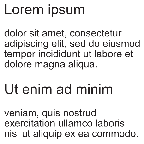
As you can see, the use of size contrast should not be too subtle, in this instance the more obvious the better. Users should instantly and definitively be able to recognize the size difference and from there, understand the importance of the information in the larger text.
This also means you need to choose your headings wisely. Make sure they are relevant, short statements that represent that section of text well. Ensure that even if users only skim through your text and read the headings, they still gain value. Headings also help screen readers navigate your content which is great for accessibility.
The sizing of your fonts and use of headings also play a role in your website’s accessibility, similar to color. If fonts are too small and people aren’t able to read them, that’s a problem. If there’s a huge block of text with no headings information can get jumbled and difficult to read. CSS tricks has a great article that digs deeper into Accessible Font Sizing.
Buttons
However, the importance of sizing goes past headings. CTA buttons play a crucial role in directing your users to where you want them to go. Button sizing needs to be taken into account, especially in responsive design. If buttons are too small on mobile, or don’t stand out, users are not going to click them.
It’s important to use color and size contrast to make your buttons noticeable and clickable for your users across all devices. Mastering the Call to Action is a great resource to learn how to create the most effective CTA buttons for your website.
Space
In web design, using negative space to create contrast between elements gives a clean and airy feel to the website. Negative space puts emphasis on the details, which can be extremely appealing if done correctly. After all, if you’re putting emphasis on the details, you need to make sure the details are noteworthy.
Working with negative space can be difficult when dealing with responsive design. Each screen size is going to react differently to different amounts of space. So, if you plan to utilize negative space in design, remember to keep responsiveness in mind. With the introduction of mobile-first indexing, if negative space is causing issues to user experience on mobile, it can drop your rankings.
Shape/Element Style
Finally, we have contrasting shapes and styles. Using a combination of shapes and styles showcases creativity and enhances the storytelling effect of your website. This use of contrast requires more of an eye for design than some other methods of contrast, but when done well it can be very effective.
The best place to start with shapes and styles is actually by looking at your target audience. Do you think they would respond better to illustrations, graphics, or images? Furthermore, which styles do you think are best to convey your message and portray your brand?
If you have physical products it’s likely you’d choose to use images rather than illustrations because people want to see what they are buying. In terms of services that don’t have tangible products more storytelling through illustrations may work best.
In Conclusion… Get Creative!
There are so many ways to utilize contrast on your website that not only will help make your site accessible but also provides your users with a memorable experience. These are but a few ideas, examples, and resources to get your wheels turning. Don’t be shy, make a statement with your website, and try out some contrast!